With just a few seconds to grab every visitor’s attention to your website, you’ll want to do your best when it comes to showcasing your Lead Magnet offer. Without pressure or anything like that, but have you checked your landing page objectively from a usability point of view? Would you be interested in sticking with it?
Some explanation of lead magnets: A lead magnet is a free offer to your website visitor in exchange for their email address. A lead is a prospect or prospect who has indicated that they are likely your target audience because they have shown interest in your content. A magnet, as the name suggests, is a tool that attracts these visitors – usually something that is felt to be valuable and given away for free.
 In a funnel, you’ll find that a lead magnet is most often the first step. Having a way to capture email addresses and trigger an automated email sequence should be an integral part of your funnel strategy, and this is where the lead magnet comes in.
Here is a list of some lead magnet examples:
• Reviews
• Catalogs
• Cheatsheet
• Checklists
• Demo videos
• Discount codes
• Instructions
• Recipes
• Reports
• List of resources
• Wipe files
• Templates
• tutorials
• Webinars
Table of Contents
Tactics to improve lead magnet Opt-ins
The trick is, lead magnets aren’t nearly as clever tactics as they used to be. People are also very skeptical of all-too-good-sounding “free” offers that are always tied to a pitch. Even so, people still want a curated, easily accessible source and exchange their contact information for it. In other words, your lead magnet definitely still has a chance and it’s worth having one on your website for you.
In other words, don’t just give up because your download rate hasn’t been overwhelming, especially unlike your page visitors. If you don’t offer anything to potential customers when they land on your page, there is a good chance you’re letting money go the door because they may never try your products.
So you want everyone to feel compelled to take action and not click right away. Fortunately, there are seven proven tactics you can use today to increase your opt-in conversion rate.
You really don’t have to be a professional designer or get the job off to fix this, it’s something you can do on a tight budget and then keep testing and tweaking yourself as well. Remember that anything you offer for free needs to be perceived as valuable – even though it’s free. Tight balance, but think again from the user’s perspective.
Add “Free” to your copy
Here are some of the recommended places to include “Free” on your website:
• Call-to-Action (CTA) buttons
• Copy of the landing page
• Navigation
• Headlines
• Email subject lines
• Email body
• Headlines
• Advertising
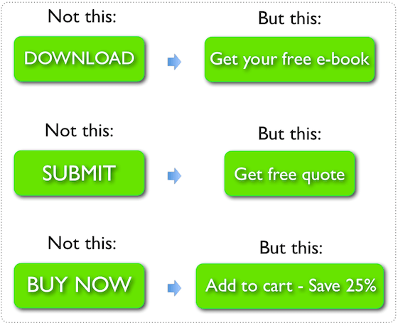
By simply adding that one word in a CTA button, you can more than double opt-in rates with even one simple adjustment, such as E.g. from “Download Now” to “Download Free”. And while we love fun and unique texts, don’t get too creative with the CTA button or link.
Use high-contrast colors for the CTA
There are design tips that can make your CTA stand out from the rest of the elements on the page and grab attention, including using a color that isn’t predominantly used elsewhere on the page. Contrasting colors make your CTA more clickable as it is instantly recognizable.
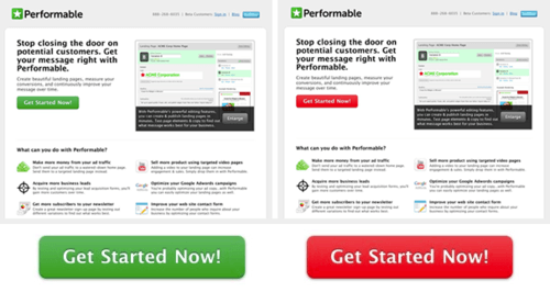
You should also make the CTA large, with enough space around it to make it clear and avoid confusion. Yes, even if you think it’s obvious, make sure it actually is.
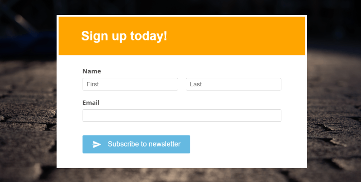
Create pop-ups
You can use different types of popups, although the exit popup is the most recommended. The intent is that if the visitor leaves your website without taking action, you have one last chance to showcase your offer.
It’s a proven tactic and urgency that encourages visitors to take action and click on the CTA. etc. Keep these direct benefits in mind when you are making the copy for your pop-up as it needs to be enticing and take into account any foreseeable objections. When selecting the timing of the trigger for your popup
Change the Offer
If you find that the number of visitors to your website does not match the number of downloads, you may need to analyze and redesign what is on offer. Perhaps the benefits are not clear enough or the text just didn’t appeal to your target audience, but you need to be critical and review the site and offer as a whole.
Make sure the title is specific, the design is intuitive, the copy is compelling, and the value is clear. Sometimes it pays to create a mockup or a sneak peek depending on the lead magnet. This is not the time to be too ambiguous or mysterious, you need to create intrigue, but also show why it is worth downloading. And then, in a broader sense, why they should become paying customers later.
Create more alignment
As you lead prospects through your funnel, you want to meet their expectations and keep what you promised. When your website visitors arrive on your landing page, they come with more or less preconceived notions of what to expect. This applies to the content as well as to the design. Everything has to make sense.

Your ad that is driving traffic to your website, whether paid or organic, needs to match your landing page to get high conversions. This is also important because a misled potential customer not only clicks at that moment but may avoid future interactions with your brand and therefore not buy from you.
Add something unique
Ultimately, there has to be a compelling reason for a visitor to swap their email address for your lead magnet. And the truth is, all of the free content is already available on the internet, so your lead magnet really needs to be a compelling collection of information.
Create a blurb, a brief summary of your Lead Magnet content, and then leave out an important piece of information that will get the visitor to download it to learn more. Make sure it’s something unique so that your lead magnet offers at least one original, valuable takeaway meal that isn’t offered anywhere else.
Optimize your CTA for mobile devices
About half of the world’s web traffic comes from mobile devices. Mobile-first is often overlooked but needs to be considered when creating your lead magnet opt-in page, especially if your traffic is coming from social media – which is one of the most popular mobile internet activities.
When optimizing for mobile, you want your CTA to be as engaging as it is on the desktop. You can first open the page on different devices with multiple screen sizes or alternatively use Google’s mobile-friendly test to check your website.
Conclusion
Gone are the days when visitors simply gave up their email address in exchange for a free offer, as many have been exposed to shoddy marketing tactics in the past. “Free” in itself is not quite enough.
But that doesn’t mean lead magnets are useless now. It just means that, more than ever, there needs to be a legitimate and compelling reason for the exchange. Don’t give up on your lead magnet or login page if you don’t see any results. Making a high-quality lead magnet is one thing, but even that doesn’t magically result in downloads.
Show your website visitors why your Lead Magnet is worth downloading and how it solves a specific pain point or problem. Using the seven tips above, combined with a strong lead generation strategy, a compelling CTA, and a well-designed opt-in page will result in more conversions and bring more prospects into your sales funnel.